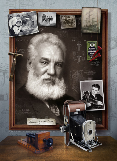
I was contacted by the art director at Yankee Magazine asking me to illustrate a feature for their 80th anniversary issue. The subject: “Inventions and Ingenuity from New England”. Nancy had seen several of my Photoshop montages over time, and believed that my style would be ideal the project. She especially liked my “Telling History” piece, a realistic montage project I’d done for the Baltimore Sun. I accepted the assignment knowing I’d enjoy another challenge of creating a illustrative visual using historic images.
THE PROJECT BEGINS
After our kickoff conversation where Nancy detailed the editorial approach and schedule, we tossed a few ideas around, and I signed Yankee’s fair contract. I would shoot the main elements, and Heather, the magazine’s photo editor, would license historical stock. Using historical stock photographs merged with my own, I would have to work some pixel magic to illustrate this interesting story.
 MY PROCESS
After receiving a draft PDF of the story, I highlighted key points to include in my research and initial sketch. I chose the image of Alexander Graham Bell as the feature element. Heather and I both collected files of historic New England inventions from stock resources and shared these via DropBox. The online research I do for my illustrations is part of the problem solving I enjoy.
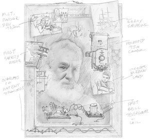
“Sketching a rough composite helps focus my brainstorming and communicate ideas the client. I usually sketch roughly on tracing paper, then refine it as I lock in my approach. In assignments with this many photo elements, I opt to merge collected JPGs and make marginal notes with my Wacom pen in Photoshop. I then convert to B&W, apply the Stylize>Find Edges filter to outline the images, then finish my sketch on a printout. I send this to the client as a PDF for approval with editorial team. This takes from 1-3 hours and is always well worth the effort.”
Compositing studio shots of objects with archival stock images, textures and patent drawings presents a challenge of creating visual consistency. Though the old photo of Alexander Graham Bell we licensed wasn’t too sharp, it had to do. Then came a discovery that changed my approach.
The photo editor found and licensed a high-resolution archival stock file of Bell’s rare early telephone. When I saw that file, I knew I’d have enough resolution to create a faux dimensional collage installed above the two main inventions upon a vintage table. I sketched that up, we agreed on the changes, and Nancy found additional budget for the significant additional work involved.

PROPS & PURPOSE
I needed a Polaroid 95, the first instant-image camera developed by Edwin Land. I bought one on Ebay. I was working on both coasts during the project’s production dates, so I shot the cherry table top and picture frame in my Maine condo, and shot the camera once back in my Seattle office
Everything else was worked with my beloved Wacom pen in Photoshop CC. I made wires, bent corners, nails, tape, pins, scotch tape, wallpaper and tarnished surfaces. I carefully ‘aged’ each photo element using layers, textures and distortion tools, then shadowed each object realistically against each surface. Great care was taken to balance the many elements compositionally so that the reader would quickly grasp the topic and then enjoy the many realistic details* relating to the story text. (click the photo to see it enlarged)
SWEATING THE DETAILS
A signature of my style is the copper hanging wires and overlaid ink drawings I use in my composites. Here I used the public domain patent drawings for the devices pictured. I made every shadow and reflection look as realistic as possible. I used blur and color to increase perceived depth. When working on a project like this one, I go down many rabbit holes I could never predict, and the hours fly by joyously. I become lost and found in Photoshop.
 WANT TO HONE YOUR PHOTOSHOP SKILLS?
Join me in Maine this late July for my sixth “Creativity and Invention in Photoshop“.
Spend a week alongside me and other creatives photographing in my favorite locations and learning the best Photoshop methods for expert RAW processing, perfecting landscapes, portraits or creating story-telling composites. It’s an incredible and immersive photographic learning experience that takes all students to the next level of their skills. I can’t wait!
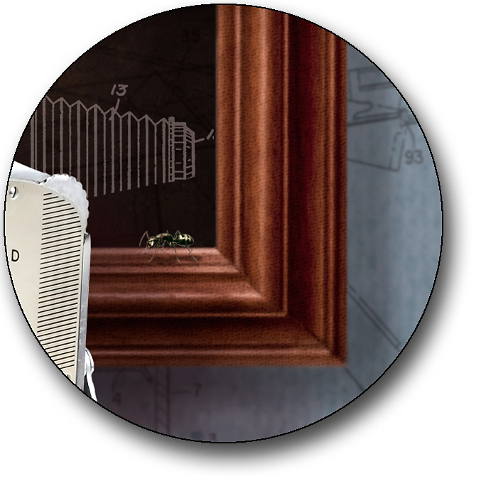
*There is a realistic ant hidden in this montage, and in almost all of my composites. The ant can take many forms, from photographic as it is here, to a stylized tattoo. I’ve long admired ants, and to me they symbolize my connection to nature, hard work and collaboration.
Keep creating,
~ dave
I'd love to share my knowledge with you.
Just fill in the blanks to subscribe for more travel stories and techniques in Photography, Lightroom and Photoshop.
I occasionally send out "The Viewfinder" e-newsletter, and provide free presets and workshop discounts.
I never over-post, share your info, and you can opt out at any time.

